Well, unfortunately, we lost track of time and we wound up being out so long that there wasn't time to run me home tonight before husband had to go teach. "No big deal," I told him. "My blog post for the day is up. I'm fine, time-wise. I'll just work on replacing images in the blog."
Right. Have I mentioned that fibromyalgia makes you stupid sometimes? Yea. I got here and saw the date, and said, "Wait a minute, that's not right..." I went to my blog and realized... EEEK! NO POST!
But fear not, readers, I have pictures!! I've been kicking around ideas for business cards ever since I printed that first set. I've doodled several possibilities, and I'm not sure which one(s) I like best. So I'm going to do a poll and get y'all's opinions!!
 First up is the original design I made. I like it, but I'd left off the Etsy link, so I've added it back in and changed the font a bit. I actually like this one a lot. It's fun, it's funky, it's got a lot of character, and I think the energy matches the energy of the blog.
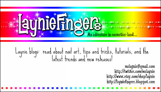
Then I started feeling rainbowlicious! I know, I know, it's entirely too bright, but seriously, isn't this cute? I can't help it, I am absolutely addicted to rainbows. I'm just not sure about how I feel about it. It's cute, though.
Then I went for hand-drawn feel. Unfortunately, these are all using brushes and fonts I've downloaded, but they combine so cutely! The problem is, I don't know if this card suits my blog. Ahhh, decisions, decisions!
So, next I added some fun hand-drawn embellishments using brushes I'd downloaded. Aren't they adorable? I thought about coloring them, but it's just too fiddly for me. There's also the question- does this work with my blog?
Finally, I added a block of text describing my blog. You may need to enlarge the image to read it. The text definitely fits the blog, but the card as a whole? I have no idea... This is hard work!
Finally, I decided to use the brushes I'd made of my own drawings along with the photo of one of my earliest nail art attempts. It's cute, but I feel like it's missing something. Again, I just don't KNOW!!
So, those of you who have an opinion, how about sharing it with me? Which card do you think I should make, and why? Which card fits the theme of my blog and my personality best? Or do you think none of them work, and I should let YOU make a card for me? At this point, I'm open to just about anything, as long as it involves having someone else make a decision! =P


I'm going to go hands down with the first choice. It is just so...You. I don't see you in the others as much, they're cute and all but not my Laynie.
ReplyDeleteLove the first and second on the most. Color is good!
ReplyDeleteOk I just looked at them all and I say go with the first one. the black and white ones just dont jive with your blogs feel and you are dead on with the rainbow one being too much color.
ReplyDeletefirst one!!!
Cant wait to see those pics of polish and nail gift sets.
The first one, its more you! :)
ReplyDeleteI really like them all, but I think the first one fits you and your blog the best.
ReplyDelete