Sunday, December 23, 2012

Home again, and flaring again.

My mom is home again, mostly back on track. Unfortunately, the hospital stay coincided with one heck of a weather change, and the combination of that plus the stress of the hospital has triggered a fibro flare. No big surprise here, I've been through this before.

So, instead of leaving the blog empty again, I'm going to share a song from youtube that has had be laughing until I almost passed out. I've watched this video four times today, and I'm not done. This one's a keeper, in my opinion!


Singing animals make me laugh til I pass out.
See my disclosure statement for more information.

Tuesday, December 18, 2012

Hospitals suck, so here's a design I've been holding on to...

Well, I'm still at the hospital with my mom. It looks like they aren't going to be able to figure out what caused her problems, but sometimes things happen. However, they've found a problem with her heart, so we're going to be here for at least a couple of days more. It's ok, though, because what they found isn't really necessarily all that bad if they can fix it now.

So, while I'm here and polish-less, I figured I'd share an image I'm planning a video tutorial for. I'll still do the video, so consider this image a teaser of sorts.

This design is actually fairly simple. I used striping tape and two colors of polish, and I set the corners with black stones to add a bit of sparkle. So cute, and there's SO much room for tweaking. This could be funky and fun or elegant. It's all up to the colors you use!

So if you would, keep my mom in your thoughts, and let's hope for the best. I want to bring her home for Christmas, and for many Christmases to come.

I need sleep.
See my disclosure statement for more information.

Sunday, December 16, 2012

I may be AFK for a few days...

This is just a brief note to let you know I may well be out of pocket for the next few days. My mother is in the hospital, and the doctors are doing tests to try and pinpoint what's going on with her. I'm staying with her in the hospital, both as daughter and as advocate.

The good news is that I've got my laptop and a decent internet connection, so hopefully I can work a bit more on my surprise. That's if I can stay awake long enough to do that. :D

Wish us luck, please...
Hospitals suck.
See my disclosure statement for more information.

A fun teaser...

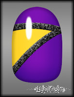
I'm working on something fun for the holiday season. I'm so excited about this one that I have to share some teaser shots with you! So, enjoy these mockups and leave me a comment if you have an idea about what I may be doing!


My husband is the best husband EVER!
See my disclosure statement for more information.

Saturday, December 15, 2012

Friday, December 14, 2012

Fibromyalgia Sucks. New Meds Suck. Being Sick Sucks.

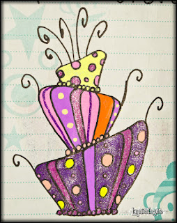
Ink, with pencil shading. The monkey
was already on the page.
Have you ever had one of those days where almost everything you can think of goes wrong? They're no fun, and you run out of curse words to use and you don't want to throw anything because it's just more crap you'll have to clean up later, right?

My last 3 months or so have been like that. I was sick, then I had a fibro flare, then I had a fibro flare while I was sick. I spent about a month mostly unable to eat or drink much and ended up in the emergency room for IV fluids and quite a few antibiotics. Once that was ok, I ended up with new fibro medicine that's kept me sleeping anywhere from 16-22 hours a day.

No, I didn't mistype and you didn't misread. I've actually spent several days asleep for 22 hours. It's not cool, and I don't recommend it.

So, with all of the medical drama, I've sort of run out of nails to write about. Who'd have thought, right? I've got the jitters from meds and I'm just plain not feeling creative when it comes to cosmetics. However, I do have lots of sketchbook goodness to share with you, so hopefully that'll inspire you some. In fact, I bet some of these sketches would make for good nail art! So, enjoy the sketches (hopefully, at least!) and the fun nail mockups!


Some days it's not worth chewing through the straps....
See my disclosure statement for more information.

Monday, November 26, 2012

Another Design With Options!

Wow, it is definitely the holiday season. How do I know? Because I've been sick for probably the last 6 weeks. None of it is life-threatening, thankfully, it's just frustrating and annoying. So many plans, and so little actual ability to accomplish anything!

I decided to play around a bit with color blocking. You can really use whatever colors you want, and I'll be showing you several options a little farther on in this entry. However, let me explain my process for this one.

I started the way I do all my designs- with a good base coat. This helps the polish adhere longer and can also prevent staining. It can be very frustrating removing a favorite color only to find you have zombie hands!

I then decided to paint random sections on my nail. If I were doing this as a whole-hand manicure, I don't think I'd make all the nails look alike. However, you totally could make them all alike and it would be lots of fun.

So, I started with the yellow polish, painting a triangle-ish shape in the center of my nail. I let that dry for a bit, then went back for the top and bottom sections and filled in with my teal and black polishes. After a few more minutes drying time, I went in with my silver striping polish and added a stripe to cover the lines where the polishes join. A coat of Seche Vite finished everything off, and I was quite happy with this design.

You could also do lots more with this type of design. You could use glitter for the stripes, you could do gradients for one or all of the sections (imagine having the gradients go in different directions!), you could go in with rhinestones or stickers... you're really only limited by your imagination. I didn't even experiment with other patterns! So, enjoy this set of mockups that all use this basic design.


So what do you think? Do you enjoy seeing these variations on a theme to see just how different the same design can look with just basic color changes? I really enjoy showing how a simple design can look so very different based on who's doing it and what spin they put on it.

Leave me a note if you like this design and definitely let me know if you enjoy these mockups. And have a belated Happy Thanksgiving for all the US people!

Some polishes may have been provided by the brands for consideration.
See my disclosure statement for more information.

Thursday, November 15, 2012

Orange Rays

Wow, looks like I had a couple of extra Halloween nails hiding that I didn't get to share with you. That's ok, though, because this is a lovely technique you can use with any colors you like, to create something soft and subtle or bold like I'm showing.

I started this nail using a Milani's High Speed Fast Dry Polish in Jiffy Orange, an intensely pigmented orange creme that does indeed dry quickly. Once it was dry, I added strips of nail striping tape radiating out from one spot on the lower left of the nail. I made sure to cut the tape long enough to leave excess on the end so that I could remove it easily once the next polish was on, and I pressed all the strips down carefully to make sure they were solidly adhered.

Again, let me repeat that it's crucial that your polish be completely dry for this step. If it isn't, you end up with some really funky stuff that needed to be removed so you can try again. It's not worth trying to rush it.

Once the striping tape is applied, I went over the top of the whole nail using Wet n Wild's Black Creme, which is unsurprisingly a black creme polish. As soon as the polish was applied I pulled each strip of tape off one by one, leaving crisp orange lines across the nail. Once again, I let this dry for a few minutes.

Because I felt the nail was still lacking something, I decided to add a spot of glitter. I used Milani's Gold Glitz, which added a bit of glam to the design. After giving this a couple of minutes to dry I then topped the whole thing off with a couple of coats of ProFX topcoat and called it a day.

I've put together a few examples of different color combinations to show just how versatile this design can be. I think it would be fun to do a rainbow ombre for the base coat, with an opaque creme on top. Or you could do the base coat in a dark glitter like Milani's Silver Dazzle and a bright gradient on top!  Hopefully you'll see something that inspires you to play!


Some polishes were provided by the brands for consideration.
See my disclosure statement for more information.